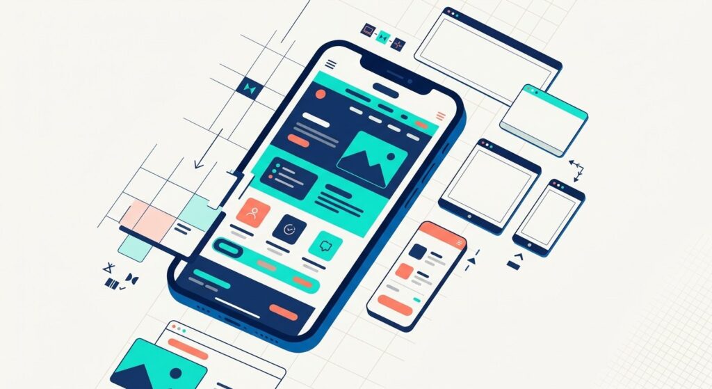
More than half of all web traffic now comes from mobile devices — and Google ranks your mobile experience before it even looks at your desktop site. If your business website still isn’t built with mobile users in mind, you’re not just losing visitors. You’re losing customers who pulled out their phone, searched for what you offer, and clicked away before you had a chance to say hello.
The good news? Getting a mobile-friendly website in 2026 is more achievable than ever — even for small business owners with no technical background. This guide breaks down, in plain language, what to expect from the designer or developer you hire so you can make smart decisions about your site, whether you’re starting from scratch or updating what you already have. If you’re comparing South Florida teams, start with our guide to choosing a South Florida web design agency.
Why Mobile-Friendly Web Design Is Non-Negotiable in 2026

Google’s mobile-first indexing has been fully in effect for years, meaning the search engine evaluates your website based on how it performs on a mobile device — not a desktop. A slow, cluttered, or hard-to-navigate mobile experience will hurt your search rankings, period.
Beyond SEO, consider what your customers are actually doing. Someone searching for a plumber in West Palm Beach at 7 p.m. is almost certainly on their phone. A restaurant owner in Boca Raton looking for a catering supplier during a busy lunch shift? Same story. If your site doesn’t load fast, display cleanly, and make it easy to take action on a small screen, that potential customer is moving on to the next result.
According to Google’s developer documentation on mobile-first indexing, sites that fail to deliver equivalent content and functionality across mobile and desktop are at a significant ranking disadvantage. That’s not a warning to ignore.
Key Elements of Modern Mobile-Friendly Web Design
1. Responsive Design That Adapts Automatically
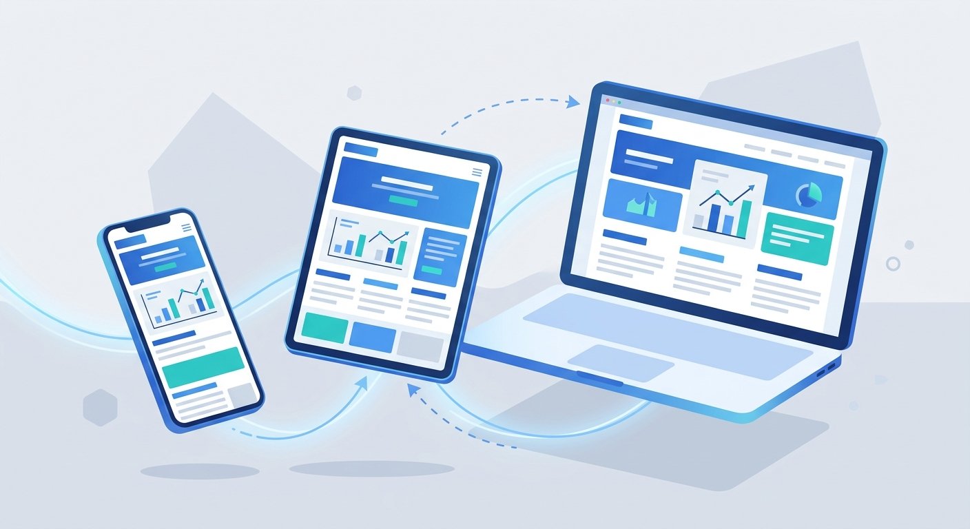
Responsive design means your website’s layout automatically adjusts to fit any screen size — phone, tablet, laptop, or desktop. This is the foundation of professional website design in 2026. It’s not a premium feature anymore; it’s the bare minimum.
With a responsive site, your text stays readable, your buttons stay tappable, and your images scale properly without cutting off. No separate mobile version to maintain. No awkward zooming. Just a clean experience everywhere.
2. Fast Load Times on Mobile Networks
Page speed matters enormously. Research from Google’s mobile page speed benchmarks has consistently shown that as page load time increases from one to five seconds, the probability of a mobile bounce increases by over 90%. Every extra second your site takes to load is costing you real business.
For modern website design, speed improvements often come from:
- Compressing and optimizing images before uploading
- Using a fast, reliable web hosting provider
- Minimizing unnecessary plugins and scripts
- Enabling browser caching and content delivery networks (CDNs)
- Using next-generation image formats like WebP
3. Touch-Friendly Navigation and Layout
On a mobile device, users tap — they don’t hover. Your navigation menu, buttons, and links need to be sized and spaced for fingers, not mouse cursors. A good rule of thumb: interactive elements should be at least 44×44 pixels with enough space between them to prevent accidental taps.
Hamburger menus (the three-line icon that expands into a full menu) remain a practical choice for mobile navigation, but make sure yours is easy to find and opens smoothly. Sticky headers that keep your main navigation visible as users scroll also improve the experience significantly.
4. Readable Text Without Zooming
If your site visitors have to pinch and zoom to read your content, your mobile experience is broken. Body text should be at least 16px, and headings should scale appropriately. Line spacing matters too — tight text is harder to read on small screens. Good mobile-friendly web design ensures your content is legible out of the box, no adjustments needed.
5. Clear Calls-to-Action Above the Fold
On mobile, “above the fold” means what a user sees before they scroll. Your most important action — whether that’s calling your business, requesting a quote, or adding a product to a cart — should be visible immediately. Don’t bury your phone number, your contact form, or your “Shop Now” button halfway down the page.
Choosing the Right Platform for Business Website Development
When it comes to actually building your site, platform choice matters. For most small and medium businesses, WordPress website design remains the top recommendation in 2026 — and for good reason.
WordPress powers about 4 in 10 websites worldwide, according to W3Techs. Its ecosystem of responsive themes and mobile-optimization plugins makes it highly practical for business website development without requiring custom code. Paired with a well-configured theme like Astra, Kadence, or GeneratePress, you can launch a fast, mobile-ready site that looks genuinely professional.
That said, the platform alone won’t save a poorly designed site. Whether you use WordPress, Shopify for eCommerce, or another builder, the fundamentals of mobile-friendly web design still apply. The platform is just the vehicle.
If eCommerce is part of your model, exploring your options through a dedicated eCommerce development strategy ensures your mobile storefront is built to convert, not just look nice.
Common Mobile Design Mistakes to Avoid
Even well-intentioned business owners make these errors when building or refreshing their sites:
- Using pop-ups that block mobile content. Google penalizes intrusive interstitials that cover content on mobile. Use banners or embedded forms instead.
- Embedding non-responsive videos. Videos that don’t scale will break your layout. Always use responsive video embeds.
- Relying on hover-state effects. Hover effects don’t translate to touchscreens. Any functionality tied to hover needs a tap-friendly alternative.
- Ignoring mobile form usability. Long forms with tiny input fields frustrate mobile users. Simplify your forms and use appropriate input types (email, phone, etc.) so mobile keyboards display correctly.
- Skipping mobile testing. Always test your site on actual devices, not just a resized browser window. Real device testing reveals issues that simulators miss.
How SEO and Mobile Design Work Together
A mobile-friendly site isn’t just better for users — it’s a direct ranking factor. Google’s Core Web Vitals, which measure real-world user experience metrics like loading speed, visual stability, and interactivity, are all evaluated in a mobile context first.
When your site loads fast, displays correctly, and makes it easy for visitors to find what they need, bounce rates drop and time-on-site increases. Search engines interpret those signals as signs of a quality, relevant page — and reward you with better visibility. It’s a reinforcing loop: better mobile design leads to better SEO, which leads to more traffic, which leads to more leads and sales.
For a deeper look at how your site’s technical performance ties into your search rankings, the team at UltraWeb Labs covers the full picture through our local SEO services. And if you’re evaluating your entire web presence from the ground up, our web design and redesign services are built around mobile-first principles from day one.
Frequently Asked Questions
How do I know if my current website is mobile-friendly?
The fastest way is to open your website on your own smartphone and navigate it as a customer would. You can also use Google’s PageSpeed Insights tool to get a technical assessment of your mobile performance, including specific issues to fix. If text is tiny, content spills off the screen, or buttons are hard to tap, your site needs work.
Does mobile-friendly design affect my Google rankings?
Yes, directly. Google uses mobile-first indexing, which means it primarily uses the mobile version of your site to determine rankings. A site that performs poorly on mobile will rank lower, regardless of how good the desktop version looks. Mobile-friendly web design is an SEO requirement, not just a user experience preference.
Do developers create mobile-friendly business websites?
Yes. Any professional web designer or developer should build a business website that works on phones as a standard part of the job, using responsive layouts, fast-loading pages, and touch-friendly navigation. Before you hire, ask to see live examples on a real phone and ask how they test mobile speed and usability. If mobile is treated as an add-on or an extra fee, keep looking.
Is WordPress a good choice for mobile-friendly business websites?
WordPress website design is an excellent choice for most small businesses in 2026. With the right responsive theme and a focus on speed optimization, WordPress sites can deliver outstanding mobile experiences. The platform’s flexibility also makes it practical for growing businesses that need to add features over time without rebuilding from scratch.
How much does it cost to build a mobile-friendly business website?
Costs vary widely depending on the scope of the project. A basic professional website design for a service business typically ranges from a few thousand dollars to more, depending on features, custom design work, and integrations. The more important question is what the return looks like — a well-built mobile site that converts visitors into leads pays for itself quickly.
How often should I update or redesign my website?
Technology and user expectations evolve fast. A general guideline is to evaluate your site’s performance annually and consider a full redesign every three to four years. If your site was built before 2022 and hasn’t been updated, it’s likely falling short of current mobile standards and may be actively hurting your search visibility. For when and how to rebuild an existing site, see our post on redesigning your website for more leads in 2026.
Ready to Build a Site That Actually Works on Mobile?
At UltraWeb Labs, we work with small and growing businesses across South Florida to create websites that look great, load fast, and turn visitors into customers — on every device. Our team builds with mobile-first principles baked in from the start, so you don’t have to worry about catching up later. Hiring a designer for your business? See how to choose a South Florida web design agency.
If your current site isn’t delivering results, or you’re ready to build something new that truly represents your business, we’d love to talk. Reach out to our South Florida team at (561) 948-0442 or visit us online to start the conversation. Your customers are on their phones right now — make sure your website is ready for them.

About UltraWeb Labs Inc.
UltraWeb Labs Inc. provides practical digital marketing solutions for small and growing businesses nationwide, with deep roots in South Florida. We specialize in eCommerce growth, lead generation, and measurable ROI through personalized service that combines approachable expertise with proven results. Our team focuses on making digital marketing accessible and actionable for business owners who want real growth without corporate-level complexity. Contact UltraWeb Labs →