
Your e-commerce store looks fantastic on your desktop computer. The product images are crisp, the checkout process is smooth, and you’re proud of the design. But here’s the problem: in 2026, over 73% of all e-commerce purchases happen on mobile devices, and if your site isn’t optimized for those shoppers, you’re literally turning away three out of every four potential customers.
For South Florida business owners running online stores, mobile-friendly web design isn’t just a nice-to-have feature anymore—it’s the foundation of your entire digital presence. Let’s talk about why mobile-first design has become absolutely non-negotiable for e-commerce success and what you need to do about it right now.
The Mobile Commerce Revolution Is Already Here

The shift to mobile shopping isn’t coming—it already happened. In 2026, mobile commerce accounts for $4.8 trillion in global sales, and the numbers continue climbing. South Florida shoppers are particularly mobile-savvy, with Miami and Fort Lauderdale ranking among the top cities for mobile shopping adoption in the United States.
What does this mean for your business? Simply put, if someone can’t easily browse your products, add items to their cart, and complete checkout on their smartphone while sitting at a Brickell café or relaxing on Fort Lauderdale beach, they’ll find a competitor who makes it easy. The mobile experience isn’t secondary to your desktop site—it’s the primary way most customers will interact with your brand.
Google’s Mobile-First Indexing: Your Rankings Depend On It
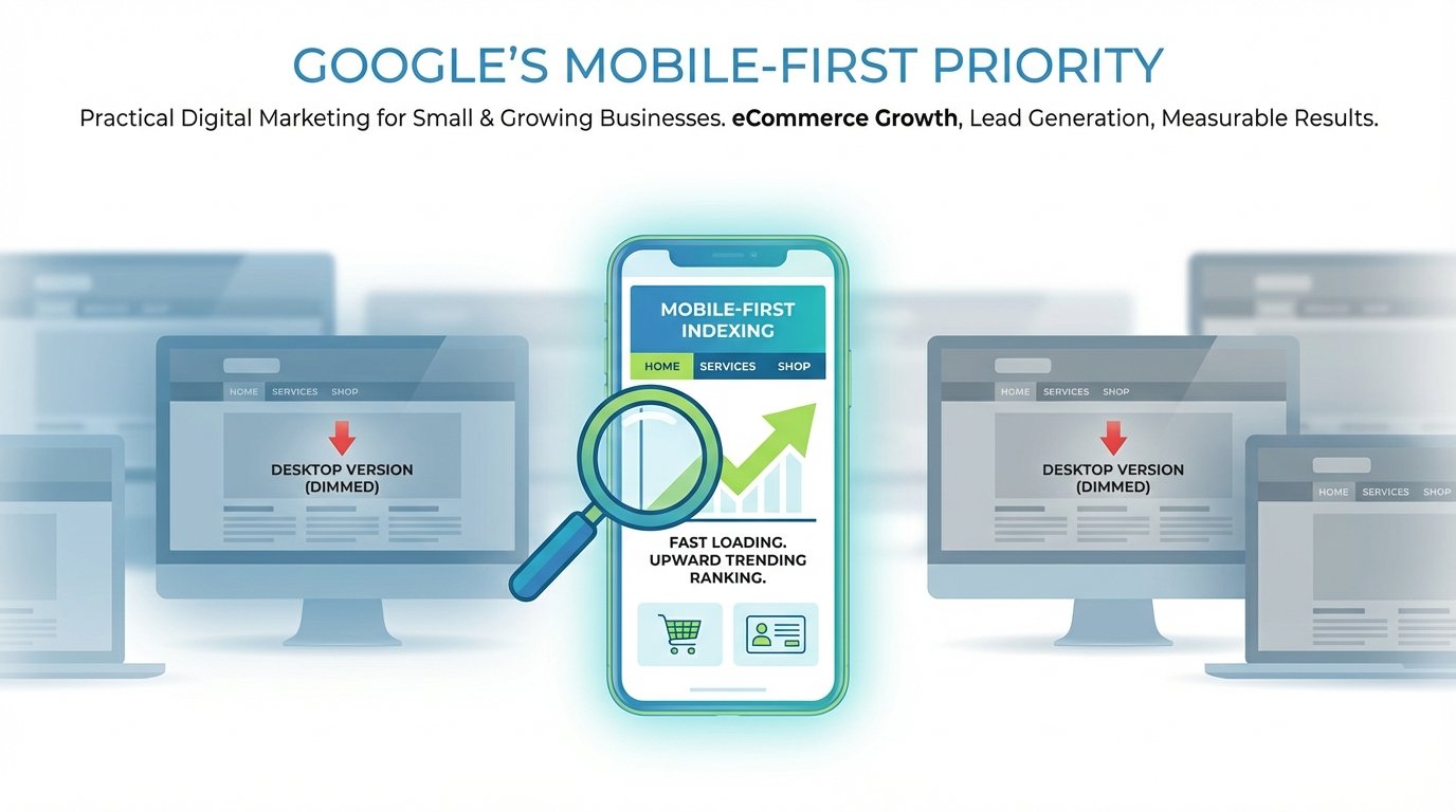
Here’s something that keeps many business owners up at night: Google now uses the mobile version of your website for indexing and ranking. This means if your mobile site is slow, clunky, or difficult to navigate, your search rankings will suffer—even for people searching on desktop computers.
Modern website design in 2026 requires thinking mobile-first from the ground up. This isn’t about creating a separate mobile site or simply making your desktop site “responsive.” It’s about designing the entire user experience with mobile users as your primary audience, then expanding that experience to larger screens.
A local Palm Beach boutique recently learned this lesson the hard way. Despite having beautiful product photography and competitive prices, their online sales stagnated. The culprit? Their website took 8 seconds to load on mobile devices and required constant zooming and pinching to navigate. After implementing true mobile-first ecommerce web design, their mobile conversion rate jumped 247% within three months.
What Mobile-First Design Actually Means for Your Online Store
Mobile-first design goes far beyond making sure your website fits on a smaller screen. It fundamentally changes how you approach online store development. Here’s what you need to focus on:
Speed Is Everything
Mobile users are incredibly impatient. Research shows that 53% of mobile visitors abandon sites that take longer than 3 seconds to load. In the e-commerce world, every second of delay can cost you 7% in conversions. Your mobile site needs to be lightning-fast, which means optimizing images, minimizing code, leveraging browser caching, and using content delivery networks.
Touch-Friendly Navigation
Fingers aren’t mouse cursors. Buttons need to be large enough to tap easily—at least 48×48 pixels—with enough spacing to prevent accidental clicks. Drop-down menus that work great on desktop become nightmares on mobile. Your ecommerce website development should prioritize simple, thumb-friendly navigation that lets users find products in three taps or less.
Simplified Checkout Process
Nothing kills mobile conversions faster than a complicated checkout process. Mobile-first design means reducing form fields to absolute essentials, implementing autofill capabilities, offering mobile payment options like Apple Pay and Google Pay, and making guest checkout obvious and easy. A Coral Springs retailer increased their mobile checkout completion rate by 34% simply by reducing their checkout from five pages to two and adding digital wallet options.
Vertical-Oriented Content
Mobile screens are tall and narrow. Your product pages should embrace this vertical orientation rather than fight it. This means stacking information logically, using collapsible sections for detailed specifications, and ensuring critical information—price, add-to-cart button, and key product benefits—appears above the fold without scrolling.
The Real Cost of Ignoring Mobile-First Design
Let’s talk numbers. If you’re driving traffic to a website that isn’t mobile-optimized, you’re essentially pouring money down the drain. Consider this scenario: You spend $2,000 monthly on Facebook and Instagram ads targeting South Florida shoppers. Those ads look great and generate 1,000 clicks to your site. But if 730 of those visitors are on mobile devices and your site isn’t optimized for mobile, most of them will bounce within seconds. You just wasted $1,460 of your ad budget.
One Delray Beach home goods store was experiencing exactly this problem. Their beautiful Instagram presence drove significant traffic, but their conversion rate remained stubbornly low at 0.8%. After implementing mobile friendly web design with optimized product galleries, streamlined navigation, and a simplified checkout process, their conversion rate jumped to 3.2%—a 400% improvement that translated to an additional $18,000 in monthly revenue without spending another dollar on advertising.
Key Mobile-First Features Your E-commerce Site Needs
If you’re ready to embrace mobile-first design, here are the essential features your online store must have in 2026:
- Responsive images that scale perfectly: Product photos should look stunning on any device without slowing load times
- One-tap phone calling: Make it effortless for customers to contact you with clickable phone numbers
- Mobile-optimized search: Include autocomplete, voice search capability, and visual search options
- Sticky add-to-cart buttons: Keep purchase options visible as users scroll through product details
- Progressive Web App (PWA) functionality: Offer app-like experiences without requiring downloads
- Mobile-friendly product filters: Let customers narrow options without overwhelming the small screen
- Streamlined product imagery: Allow pinch-to-zoom and easy swiping between product photos
- Clear shipping and return information: Make policies easy to access without disrupting the shopping flow
Testing Your Mobile Experience
Here’s a simple exercise: Pull out your smartphone right now and try to make a purchase from your own website. Don’t just browse—actually go through the entire process from landing on your homepage to completing checkout. Be honest about the experience. Did anything frustrate you? Did you have to zoom in to read text? Were buttons too small to tap accurately? Did the checkout process feel tedious?
Better yet, hand your phone to someone unfamiliar with your site and watch them try to make a purchase. Their struggles will reveal exactly where your mobile experience falls short. This real-world testing is invaluable for understanding how actual customers experience your online store development.
The Competitive Advantage for South Florida Businesses
Here’s the good news: many of your local competitors still haven’t fully embraced mobile-first design. This creates a massive opportunity for South Florida business owners who get it right. When your mobile experience is seamless and your competitors’ sites are frustrating to use on smartphones, you don’t just win that sale—you often win a loyal customer who won’t bother checking competitors next time.
A Miami Beach swimwear company discovered this advantage firsthand. After rebuilding their site with mobile-first ecommerce web design, they noticed something interesting in their analytics: their mobile bounce rate dropped from 68% to 31%, but their repeat customer rate also increased by 42%. Customers who had a smooth mobile experience weren’t just buying once—they were coming back again and again.
Working with the Right Web Design Partner
Implementing true mobile-first design requires expertise. This isn’t about applying a mobile-responsive template to your existing site. It requires rethinking your entire user experience, optimizing technical performance, and continuously testing and refining based on real user behavior.
Look for a web design partner who understands modern website design principles and has specific experience with ecommerce website development. They should talk about mobile load times, conversion optimization, and user experience testing—not just how pretty your site will look. Ask to see mobile analytics from their previous e-commerce clients. Real results matter more than design awards.
Most importantly, choose someone who understands your local South Florida market. Shopping behaviors in Boca Raton differ from those in Hialeah. Tourism-heavy areas like Key West require different approaches than residential communities. Your web design partner should understand these nuances and how they impact mobile shopping behavior.
Taking Action Today
Mobile-first design isn’t a trend that might fade—it’s the reality of how people shop online in 2026. Every day you operate with a non-optimized mobile experience, you’re losing customers and revenue to competitors who’ve made the investment.
Start by auditing your current mobile performance. Use Google’s Mobile-Friendly Test and PageSpeed Insights to identify technical issues. Review your mobile analytics to understand where users are dropping off. Then prioritize improvements based on what will have the biggest impact on your conversion rate and revenue.
The businesses thriving in e-commerce today aren’t necessarily those with the biggest budgets—they’re the ones who’ve recognized that mobile-first design is the foundation of online success and have acted accordingly.
Ready to transform your online store with mobile-first design that actually drives sales? UltraWeb Marketing specializes in helping South Florida businesses create e-commerce experiences that convert mobile visitors into customers. We combine technical expertise with local market knowledge to build online stores that don’t just look great—they deliver measurable results. Contact us today for a free mobile experience audit and discover exactly how much revenue your current site is leaving on the table.
Frequently Asked Questions
What’s the difference between mobile-responsive and mobile-first design?
Mobile-responsive design adapts a desktop site to fit smaller screens, while mobile-first design starts with the mobile experience as the primary design and builds up to desktop. Mobile-first typically delivers better performance, faster load times, and higher conversion rates because it prioritizes the way most people actually shop online in 2026.
How much does mobile-first e-commerce website development typically cost?
Costs vary based on your store’s complexity, product catalog size, and features needed. A basic mobile-first e-commerce site for a small business typically ranges from $5,000 to $15,000, while more complex stores with advanced functionality can range from $15,000 to $50,000. The investment typically pays for itself within months through improved conversion rates.
Will mobile-first design hurt my desktop conversion rates?
No—when done properly, mobile-first design actually improves user experience across all devices. The principles of fast loading, clear navigation, and streamlined checkout benefit desktop users too. Many businesses see conversion rate improvements on both mobile and desktop after implementing mobile-first design.
How long does it take to implement mobile-first design for an existing e-commerce store?
A complete mobile-first redesign typically takes 6-12 weeks depending on your store’s size and complexity. This includes planning, design, development, testing, and optimization. However, you can often implement high-impact improvements like checkout optimization and speed enhancements in just 2-3 weeks.
Can I just use a mobile app instead of optimizing my website?
While apps have their place, they require users to download software before making a first purchase, which creates a significant barrier. Most customers discover products through search and social media, landing on your website first. Your mobile website needs to be excellent regardless of whether you also have an app.